Friday, March 28, 2014

Tazria- Conditional Statements and Flow Charts

"Hashem spoke to Moshe and Aaron, saying: If a person will have on the skin of his flesh a s'eit, or a sepachat, or a baheret, and it will become a tzara'at affliction on the skin of his flesh; he shall be brought to Aaron the Kohen, or to one of his sons the Kohanim. The Kohen shall look at the affliction on the skin of his flesh: If hair in the affliction has turned white, and the affliction's appearance is deeper than the skin of his flesh-it is a tzara'at affliction; the Kohen shall look at it and make him impure.
If it is a white baheret on the skin of his flesh and its appearance is not deeper than the skin, and the hair has not turned white, then the Kohen shall close off the affliction for a seven-day period. The Kohen shall look at it on the seventh day, and behold!- the affliction remained in its appearance, and the affliction did not spread on the skin, then the Kohen shall close him off a second time for a seven-day period. The Kohen shall look at it again on the seventh day, and behold!- if the affliction has dimmed and the affliction has not spread on the skin, then the Kohen shall declare him pure, it is a mispachat; he shall immerse his garments and become pure. But if the mispachat should spread on the skin after it had been shown to the Kohen for its purification, it should be shown to the Kohen again. The Kohen shall look, and behold!- the mispachat has spread on the skin; the Kohen shall make him impure; it is tzara'at." ~Vayikra 13;1-8

In continuation of our study of understanding information and organization of information using graphic organizers, this week we'll look at two new ideas: 1) conditional statements and 2) flow charts.

Conditional Statements:
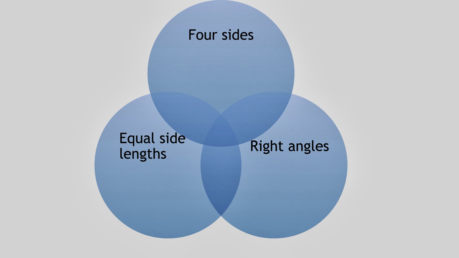
Conditional statements are statements in "If..., then..." form that give you a piece of information that is based on whether or not the other part is true. For example, "If it rains, I will need my umbrella." This statement tells me that I may or may not need an umbrella, and the way to determine if I do is based on whether or not it rains. If it rains, yes, I do; if it doesn't rain, no, I don't. Conditional statements are used in math to organize information, and often students will work with conditional statements to determine whether they are true or false. "If a shape has four sides, then it's a square." This statement could be true, but is not always true, since there are other shapes that also have four sides, and our statement is not specific enough about the shape. Sometimes, switching the first and second clauses can make a false statement true- "If a shape is a square, then it has four sides." We just took a statement that is not always true and made it into one that is always true, since a square does always have four sides. Rearranging the order of clauses and adding or removing negatives in clauses of conditional statements can be a whole exercise on its own, and is typically studied in conjunction with beginning algebra concepts. For our purposes this week, we just need to understand what a conditional statement is.

Flow Charts:
Flow charts are an organizational tool that can be used to make sense of a process or "flow" of information. You start at one point and determine what that information leads you into. Often, there are two or more options that come out of one point and the flow chart helps you separate what happens in case 1 of this situation from what happens in case 2 of this situation. The flow chart offers a visual representation of the process in the situation with which you are working.

Parsha Connection:
In this week's parsha, we are told about the process that the Kohen must go through to determine whether or not a person has tzara'at. Using a flow chart to map out the conditional statements that are given, we can create a visual aid for understanding when a person is diagnosed with tzara'at (impure) and when they are ok (pure).

We begin by charting the initial situation along with any possible first step outcomes from the situation.


Next, we take each of those outcomes and see if a final decision is made or if there is a follow-up step that occurs as part of the outcome. In our case, if the person is determined to be either pure or impure then that path has ended; if a determination has not yet been made, then the path will continue.


Now we take the follow-up step and chart the possible outcomes from that step.


From here, we continue, as before, and look to see if a final decision was made and each path has ended, or if follow-up steps are required based on the outcomes. We chart each path until all paths end at either a pure or impure status.


This is just one situation that lends itself to being graphed in a flow chart in this week's parsha. Try your hand at flow charts by mapping out another situation.

Thursday, March 20, 2014

Shmini- Venn Diagrams

"Hashem spoke to Moshe and to Aaron, to say to them. Speak to the Children of Israel, saying: These are the forms that you may eat from among all the animals that are upon the earth. Any one among the animals that has a split hoof, which is separated with a split [into] hooves, and that brings up its cud- that one you may eat. But this is what you shall not eat from among those that bring up their cud or that have split hooves: the camel, for it brings up its cud, but its hoof is not split- it is impure to you; and the hyrax, for it brings up its cud, but its hoof is not split- it is impure to you; and the hare, for it brings up its cud, but its hoof is not split- it is impure to you; and the pig, for its hoof is split and its hoof is completely separated, but it does not chew its cud- it is impure to you. You may not eat of their flesh nor may you touch their carcass- they are impure to you." ~Vayikra 11;1-8

For the past couple of weeks we have been looking at how to graph data in order to create visual representations of information. Now I'd like to look at a couple of different graphic organizers which allow you to organize information visually to help better understand the meaning of the information with which you're working. This week we'll look at venn diagrams.

Venn Diagrams:
A venn diagram is a type of graphic organizer that allows you to specifically compare groups/sets/categories and understand which individual items they share in common. A venn diagram is made up of multiple circles that overlap. When organizing your information in the graph, each category has it's own circle, and items that belong in that category are placed in the labeled circle. Any items that belong in multiple categories are placed in the sections of the graph where their two (or more) categories overlap. Any new group of items created by the overlap of two or more categories is known as the intersection of those categories.

Parsha Connection:
Let's start by looking at a basic, two category, venn diagram using the information in this week's parsha about kosher animals.

First we draw the two circles- one for each category- and have them overlap in the center.


Next, we label each circle with the category that is represented there.


Now we look at the information that we are given about each category and separate our samples into the proper circles. Placing samples from overlapping categories into the overlapping sections of the diagram.


Finally, we label any sections that indicate a group for which no samples have been given. In our case, the Torah doesn't give us examples of any kosher animals, so we will label this section in the graph.


For our purposes, in our parsha example, we only had two categories to compare. However, you can compare many categories in this way. For each new category, a new circle is added, and the venn diagram provides a section for any combination of categories overlapping with each other.

In younger grades, students often begin by sorting items by shapes or colors to begin working with venn diagrams. In older grades, venn diagrams can be used for comparing sets of numbers and thinking about concepts such as intersections and unions of sets. Of course, these diagrams are also useful as graphic organizers for any subject, as well- to compare information between two literature pieces, about two different time periods, about different scientific concepts. Venn diagrams are a wonderful tool for any subject.

Here's a sample of a more complex, 3 circle diagram comparing shapes with 4 sides, shapes with right angles, and shapes with equal side lengths.

Here is the blank diagram set-up with the labeled circles:


And here is our completed diagram:


Friday, March 14, 2014

Tzav- Statistics part 2

Once again, this week we have a significant portion of the parsha dedicated to specifics of korbanot, or sacrificial offerings. Again, rather than quoting from the parsha, I've organized some of the information related to the offerings in order to analyze.

Pie Chart/Circle Graph:
Whereas the bar graphs we looked at last week compared a measured amount between different categories, a circle graph compares portion sizes of categories that together make up 100% of something. For example, out of your total budget allotment, what percentage of the budget goes to different categories (food, medical, housing costs, etc.)? Out of all after school enrollment, what percentage of students go to each of the different activities? Out of the total hours in a day, what percentage of time is spent sleeping, eating, working, etc.? The key to circle graphs is that all categories together add to 100% and create a complete circle. 

When analyzing data to convert into a circle graph, we'll need our knowledge of fractions (Parshat Vayishlach), proportions (Parshat Ki Tisa), and percentages (Parshat Vayigash) to convert the raw data into a format that will fit the circle graph.

Connection to Parsha:
Let's take a look at a sample data set from this week's parsha to walk us through the process. Let's look at what percentage of sacrifices were to be fully burned and what percentage of sacrifices were allowed to be partially eaten in some form.

We can start by making a chart to organize the information so that we see which category each sacrifice falls into.


Next, we use the chart to count up how many sacrifices are in each category out of the total number of sacrifices. According to our chart, out of the 6 total sacrifices, we have 3 sacrifices that are completely burned and 3 sacrifices that are partially burned and partially eaten.

Let's restate this as fractions- 
3/6 = burned 
3/6 = burned then eaten

If we want, we can reduce these fractions (each reduces to 1/2), but we don't have to. In this case, we will reduce them, since it will make our next calculation easier to work with. 

So, we have-
1/2 of the sacrifices are burned
1/2 of the sacrifices are burned then eaten

Now, remember that the most important part of a circle graph is that it shows a percentage out of 100%, where 100% (or all) of what you're analyzing makes up the full circle. So, if 100% of the sacrifices is all of them, we know that 1/2 of the sacrifices were burned: 100% x 1/2 = 50% and 1/2 of the sacrifices were burned then eaten: 100% x 1/2 = 50%. So now we have calculated that 50% of the sacrifices were totally burned and 50% were burned then eaten. Once we have this calculation, we can create our graph. 


While I made the graph electronically, you can also construct a circle and measure out the angle measures for each section using pencil, paper, drawing compass, and protractor. Such an activity offers a good opportunity for art/geometry integrations in math. To calculate the sections by hand, we need to first know a full circle is 360°. Since we need 1/2 of the circle for each category, we multiply 360° x 1/2 = 180°. This means that the angle measure for each section of the circle needs to be 180°. Measuring out this 180°, you'll find that you've perfectly divided the circle into two 50% sections, one for each category.

It happened that the numbers for this activity fell perfectly into two equal groups. While it may seem simplistic because of the easy numbers and category divisions, it would make a very simple way to practice going through the steps of the process and practicing drawing circles and interior angles. Once practicing with this easy example, another problem with more complex category divisions could be introduced.


Friday, March 7, 2014

Vayikra- Statistics part 1

About the Parsha:
In Parshat Vayikra we have 5 chapters that just list different types of sacrificial offerings that can be brought. Rather than quoting sections of the parsha, I've reduced the information into the summary below:

olah-offering-- male cattle
olah-offering--male sheep or goat
olah-offering--turtledoves or young doves
meal-offering--fine flour, oil, frankincense
meal-offering--first fruits
peace-offering--male or female cattle
peace-offering-- male or female from flock (sheep or goat)
Kohen's sin-offering-- young male cattle
Community sin-offering-- young bull (male cattle)
Ruler sin-offering-- male goat
individual sin-offering-- female goat or sheep
guilt-offering--female sheep or goat
guilt-offering-- two turtledoves or two young doves (if can't afford sheep/goat)
guilt-offering-- flour (if can't afford doves)
guilt-offering-- ram

What is a graph?
A graph is a visual representation of information in order to easily compare information in a given situation. There are many types of graphs- line graphs, bar graphs, pie charts, histograms, venn diagrams- each type of graph is suited to a certain type of information and a certain format. A pie chart, for example, gives information about the division of categories within a total group, or sectional percentages out of 100%.

For the next few weeks, I'd like to look at different types of graphs and statistical analysis of information that's given in the parshiot.

For this week, we'll look at bar graphs. Bar graphs are graphs that are used to compare categories. A vertical bar graph has the names of the categories on the bottom of the graph, and the left side of the graph has the number scale to show how much is measured in each category. A horizontal bar graph can display the same exact information, but the graph is turned sideways- the names of categories are on the left of the graph, and the number scale is along the bottom of the graph.

It's interesting to look at different ways that the same information can be graphed- each graph bringing out different aspects of the information.

Let's first make a graph showing how many options there are for each type of offering. First we'll organize our data:

*olah-offering: (3 options)
--cattle
--sheep/goat
--doves
*meal-offering: (2 options)
--fine flour mixture
--first fruits mixture
*peace-offering: (2 options)
--cattle
--sheep/goat
*sin-offering: (4 options)
--Kohen (cattle)
--community (cattle)
--ruler (goat/sheep)
--individual (goat/sheep)
*guilt-offering: (4 options)
--sheep/goat
--doves
--flour
--ram

Now that we have our data organized the way we want it, we can graph it (chart on top, graph underneath):

Number of Options for Sacrifice Types:


Now, what if we make a graph of how many must be male animals, must be female animals, could be either male or female, or are grain/fruit?

Again, let's first organize our data:

*male animals: (8 options)
--olah-offering (x3)
--sin-offerings (x3)
--guilt-offering (x2)
*female animals: (2 options)
--sin-offering (x1)
--guilt-offering (x1)
*male or female: (2 options)
--peace-offering (x2)
*grain/fruit: (3 options)
--meal-offering (x2)
--guilt-offering (x1)

Now that we have our data organized the way we want it, we can graph it (chart on top, graph underneath):

Number of Sacrifices by Animal Type:


So, here we have two very different graphs, both based on the same exact data set, but focusing on different aspects of the information; one looks at which sacrifices have the most options for what can be offered for that type of sacrifice, and the other looks at how many sacrifice types each animal can be used for. 

Some good questions for testing for understanding of graphs might be: Which category has the most options? Which category has the least? Are there any that have the same amount? How much difference is there between two given categories? These questions can be tailored for each specific graph that you're reading.